


Case
STudy 1
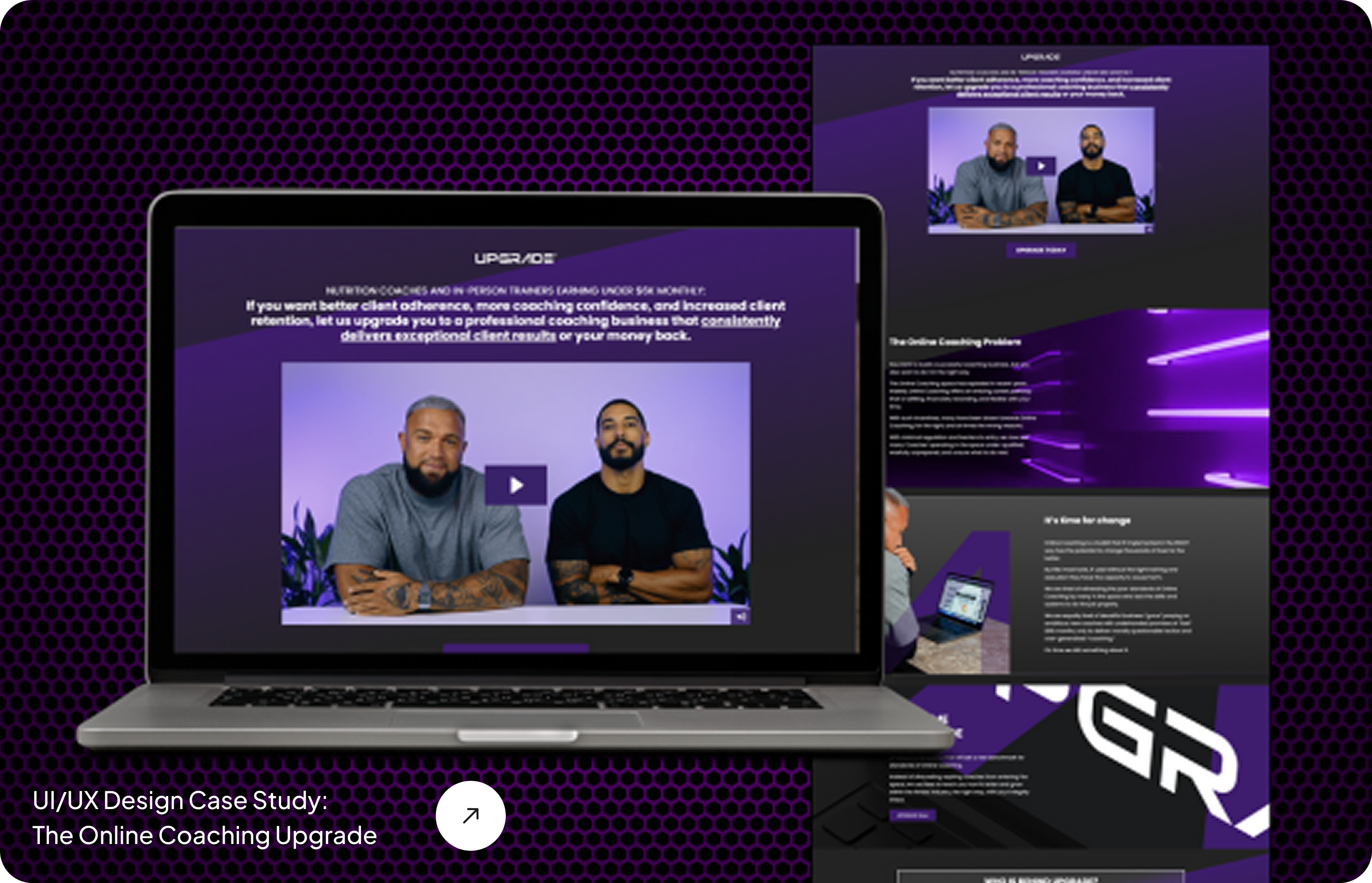
How to Design a Sales Page for The Online Coaching Upgrade
Case
Study
one
How to Design a Sales Page for The Online Coaching Upgrade
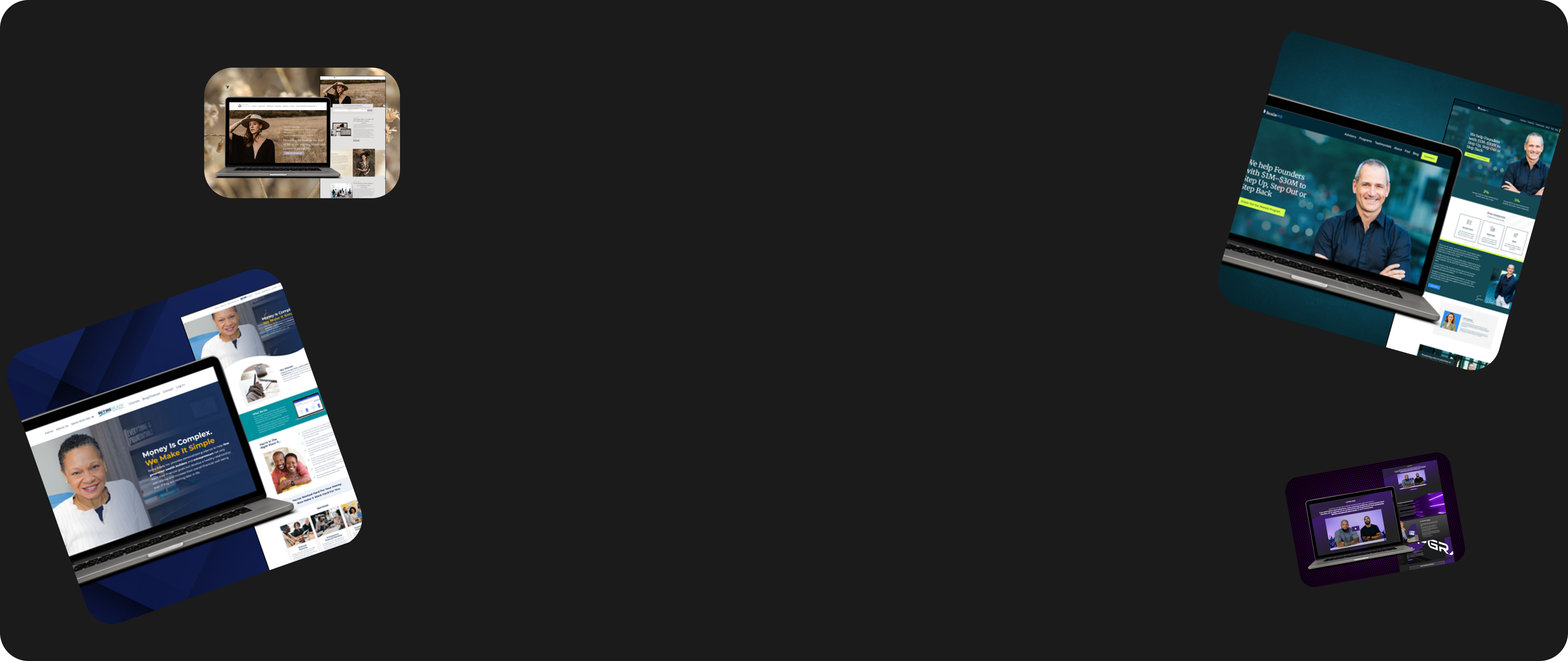
Creating a sales page is one of the most important parts of conversion. It’s not just any webpage, it’s where people decide if they’re signing up or buying. In this case study, we’ll show you how to design a sales page. We’ll explain it using an example from one of our clients.
The Client
Project: Sales Page Design
Client: Aaron Straker & Jackson Peos
Brand: The Online Coaching Upgrade
Agency: SavvyChic Design
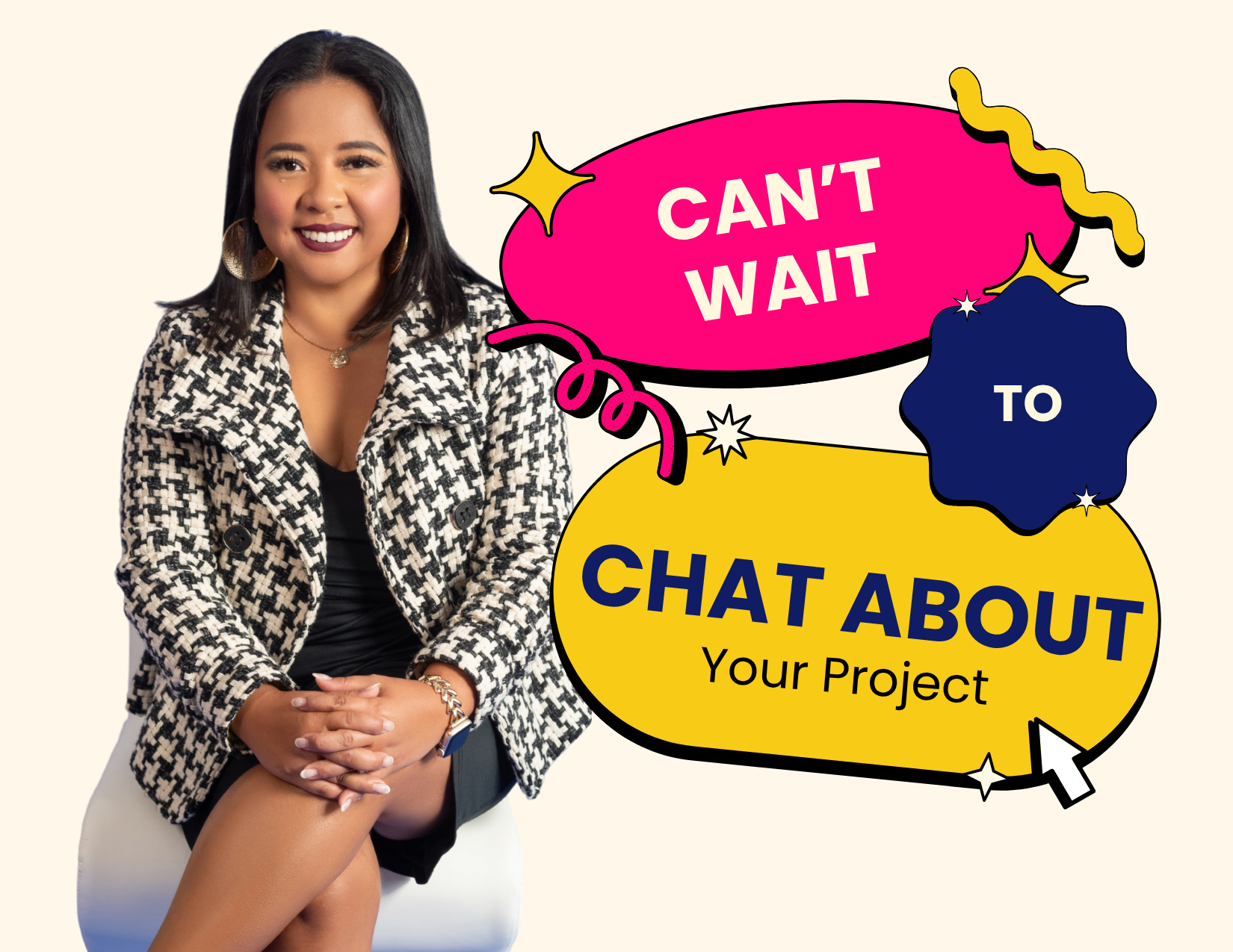
Are you an online coach looking for someone to create your creative sales page? Contact us today!
Goals: Launch 4 times a year
20 seats per cohort (starting with 10)
Second Step: Design the strategy.
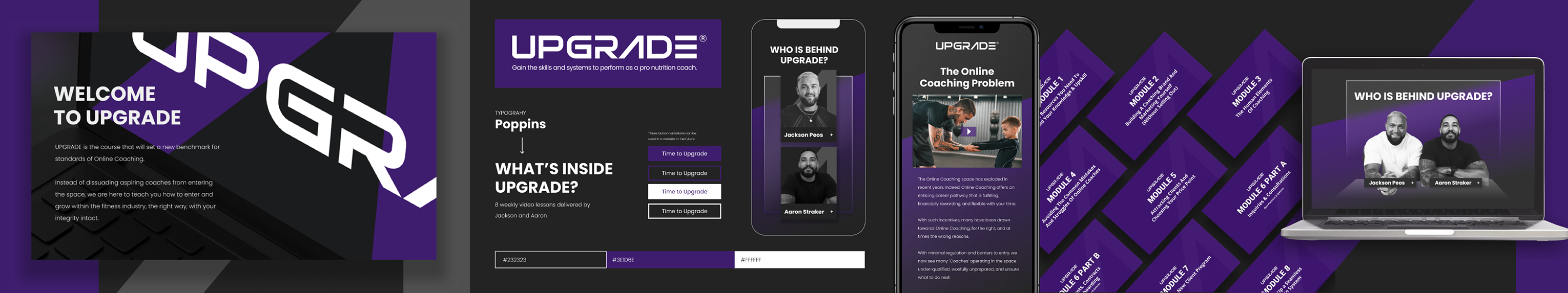
After intensive research, we created a strategic plan for how the design would look. The sales page needed to have a clean layout, a strong hero section with a headline and hype video, and be easy to navigate.
Check out SavvyChic Design
We Decided the Sales Page Needed To:
Look modern and professional
Clearly show value
Include a hype video
Guide users to apply now or join the waitlist
Design Direction
The page had to look bold, clean, and trustworthy. We used a dark theme, strong visuals, and clean sections to guide the user. The vibe we went for: inspiring, high-value, and confident.
Third Step: The Written Content.
Here’s what we’ve learned and what you should always remember when writing your own.
1. Keep the content easy to scan
No one wants to read long, bulky paragraphs. Write a scalable copy that’s short, punchy, and easy to understand. Use headlines and short sections that people can scroll through fast. Your message should be clear.
2. Talk about the problem and give them the solution
Start with what your audience is struggling with. Then show them what you’ve built and how it solves that exact problem. Make it obvious, keep the CTA clear, and don’t forget to create urgency.
Final Result
The Online Coaching Upgrade now has a sleek, high-converting sales page they use for every launch.
Want to get more clients as an online coach? Book your free call now.
Transform Your Ideas into
Impactful Designs
Creating a sales page is one of the most important parts of conversion. It’s not just any webpage, it’s where people decide if they’re signing up or buying. In this case study, we’ll show you how to design a sales page. We’ll explain it using an example from one of our clients.
The Client
Project: Sales Page Design
Client: Aaron Straker & Jackson Peos
Brand: The Online Coaching Upgrade
Agency: SavvyChic Design
Goals: Launch 4 times a year
20 seats per cohort (starting with 10)
Second Step: Design the strategy.
After intensive research, we created a strategic plan for how the design would look. The sales page needed to have a clean layout, a strong hero section with a headline and hype video, and be easy to navigate.
Check out SavvyChic Design
We Decided the Sales Page Needed To:
Look modern and professional
Clearly show value
Include a hype video
Guide users to apply now or join the waitlist
Design Direction
The page had to look bold, clean, and trustworthy. We used a dark theme, strong visuals, and clean sections to guide the user. The vibe we went for: inspiring, high-value, and confident.
Third Step: The Written Content.
Here’s what we’ve learned and what you should always remember when writing your own.
1. Keep the content easy to scan
No one wants to read long, bulky paragraphs. Write a scalable copy that’s short, punchy, and easy to understand. Use headlines and short sections that people can scroll through fast. Your message should be clear.
2. Talk about the problem and give them the solution
Start with what your audience is struggling with. Then show them what you’ve built and how it solves that exact problem. Make it obvious, keep the CTA clear, and don’t forget to create urgency.
Final Result
The Online Coaching Upgrade now has a sleek, high-converting sales page they use for every launch. Do check out : Product Design Case Study: Crafting the Sioshe Brand Identity
Book your free call now.
Do check out : Product Design Case Study: Crafting the Sioshe Brand Identity
Want to get more clients as an online coach? Book your free call now.
Transform Your Ideas into
Impactful Designs
Transform Your Ideas into
Impactful Designs
Let’s Work Together and Create Something Extraordinary!
FOLLOW US
Stay connected and inspired! Follow us on our social media platforms to keep up with the latest design trends, project updates, and behind-the-scenes insights
DESIGN SERVICES
LEAD GENERATION
RESOURCES
COMPANY


Copyright 2026. SavvyChic Design . All Rights Reserved. | Privacy Policy | Terms and Condition
Let’s Work Together and Create Something Extraordinary!
DESIGN SERVICES
MARKETING SERVICES
LEAD GENERATION
RESOURCES
COMPANY
FOLLOW US
Stay connected and inspired! Follow us on our social media platforms to keep up with the latest design trends, project updates, and behind-the-scenes insights
Copyright 2026. SavvyChic Design . All Rights Reserved. | Privacy Policy | Terms and Condition