


Case
STudy 1
HOW TO DESIGN A PRODUCT
FOR SKINCARE
Case
Study
TWO
How to Design a Sales Page for The Online Coaching Upgrade
Designing a brand is about meaning, purpose, and connection. SavvyChic Design has been doing research and analysis for years on how to design a brand perfectly and elegantly. In this case study, we’re sharing how to design the brand identity of a company.
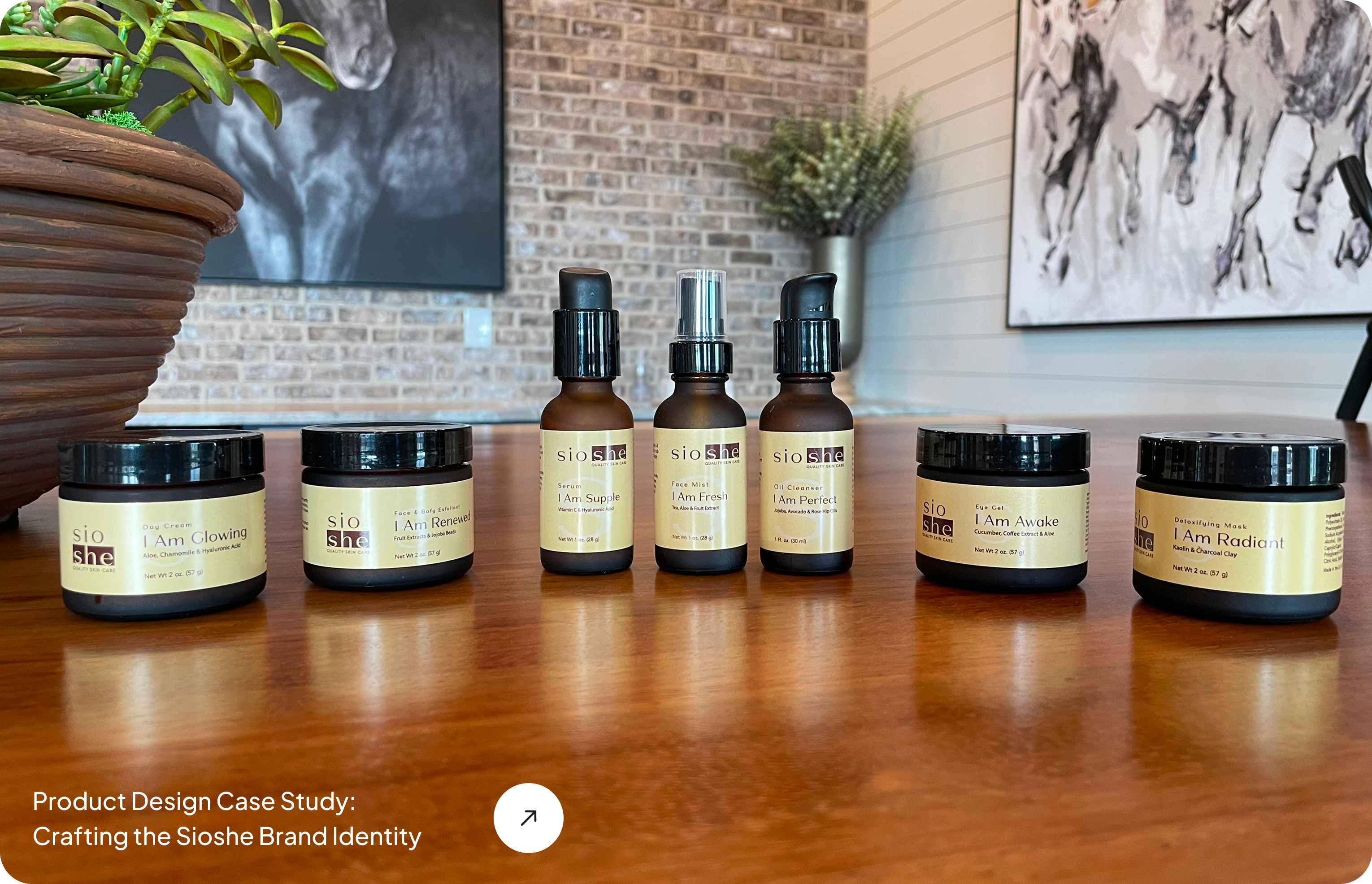
We helped a skincare company Sioshe launch with a strong and elegant brand presence and today, we’ll share the story with you.
Client: Sioshe
Project: Foundational Brand Identity Design
Agency: SavvyChic Design
So, How to design a brand?
Step One:
Understand the Brand Message
Before getting into design, we focused on research. The goal was to fully understand what Sioshe stands for and who it serves.
Sioshe (pronounced See-OH-she) is a clean skincare brand focused on simplicity, self-care, and elegance. It’s made for women who take care of everyone else and are now ready to care for themselves.
We studied the market, looked at competitors, and learned what makes Sioshe different. That helped us shape the visual and verbal identity with purpose. We decided on a few key points.
The Brand Mission
Sioshe helps women reconnect with themselves through simple, high-quality skincare routines.
The tone had to feel calm and confident, not flashy or over-designed. Sioshe stands for quiet strength and everyday luxury.
The Challenge
Sioshe was entering a saturated space. Clean skincare is everywhere. But Sioshe isn’t trend-focused. It’s timeless. The challenge was to stand out while staying soft and grounded.
We Needed To:
Build a premium but approachable identity
Avoid anything overly trendy or high-saturation
Help the brand feel calm, clean, and trustworthy
We designed Sioshe for:
Women aged 28–45
Working professionals, managers, nurturers
Based in the U.S.
People who often put others first
Looking for simple, nourishing routines
Interested in clean ingredients and minimal design
These are women who want skincare that’s easy to use, high in quality, and aligned with their lifestyle.
Step Two:
Design Strategy
We started with a clear plan. Every part of the brand had to reflect calm, elegance, and balance.
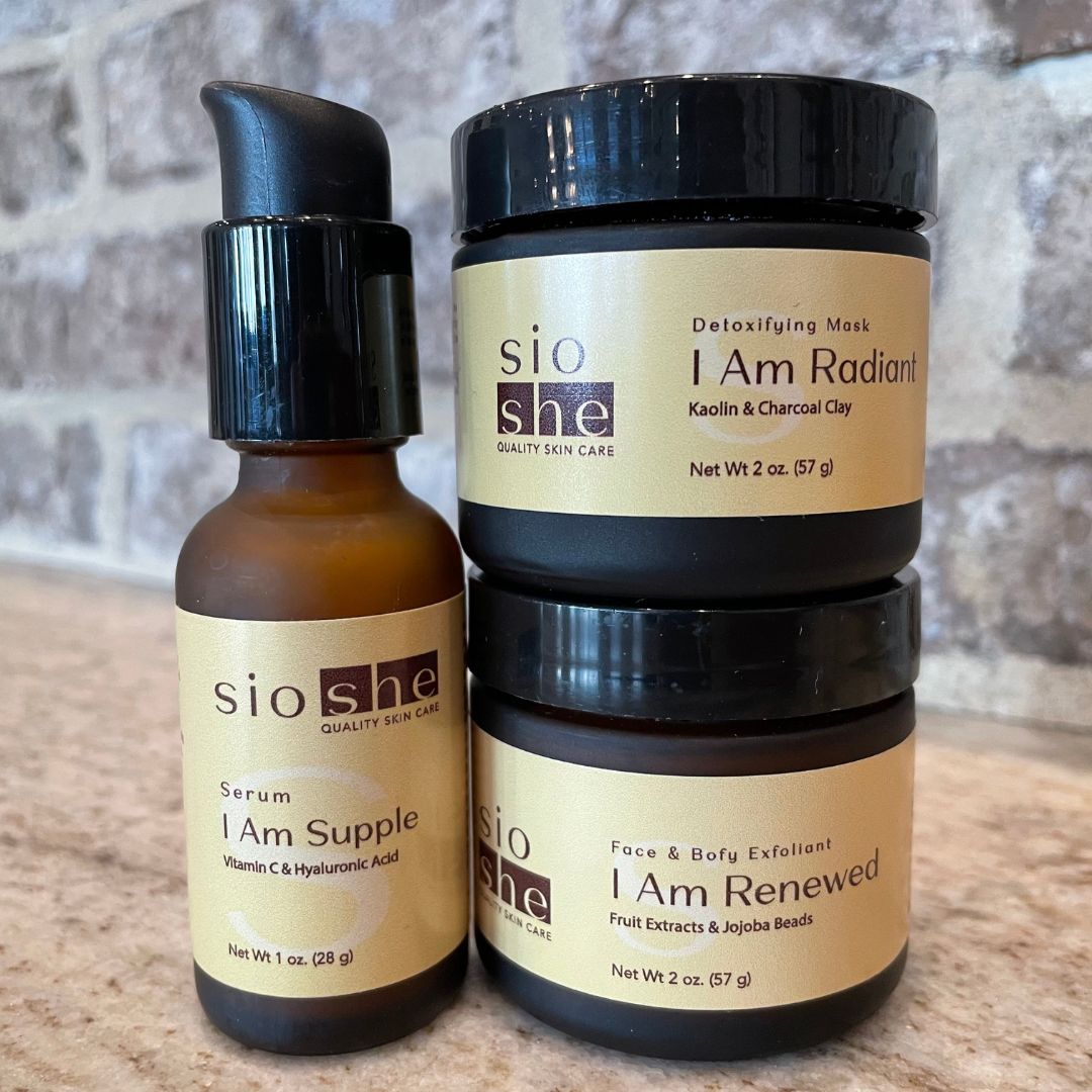
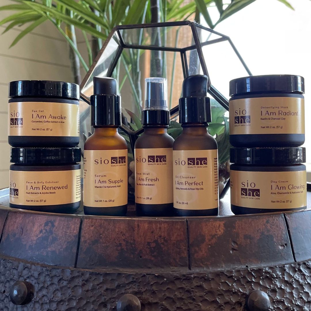
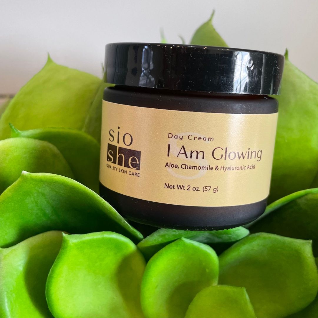
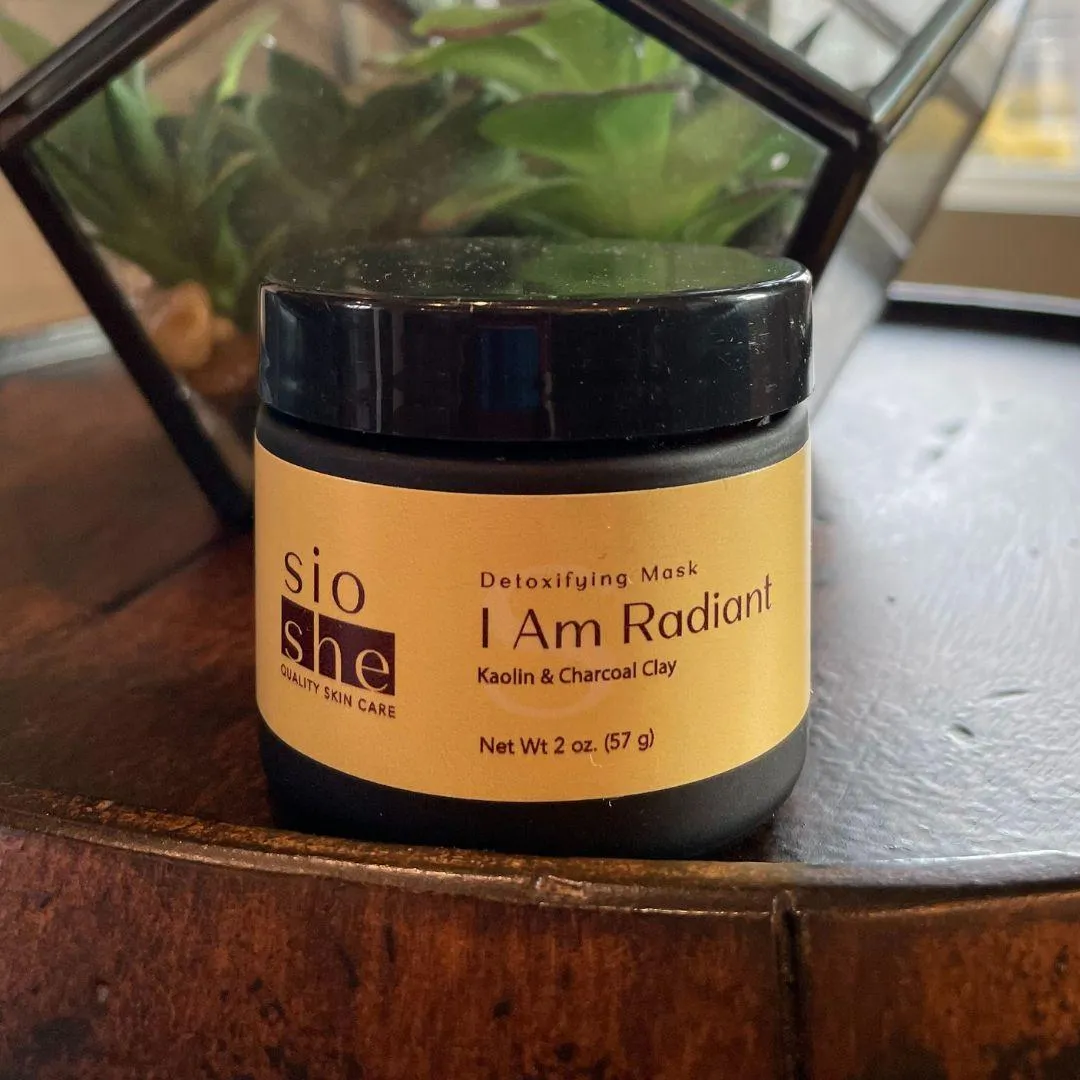
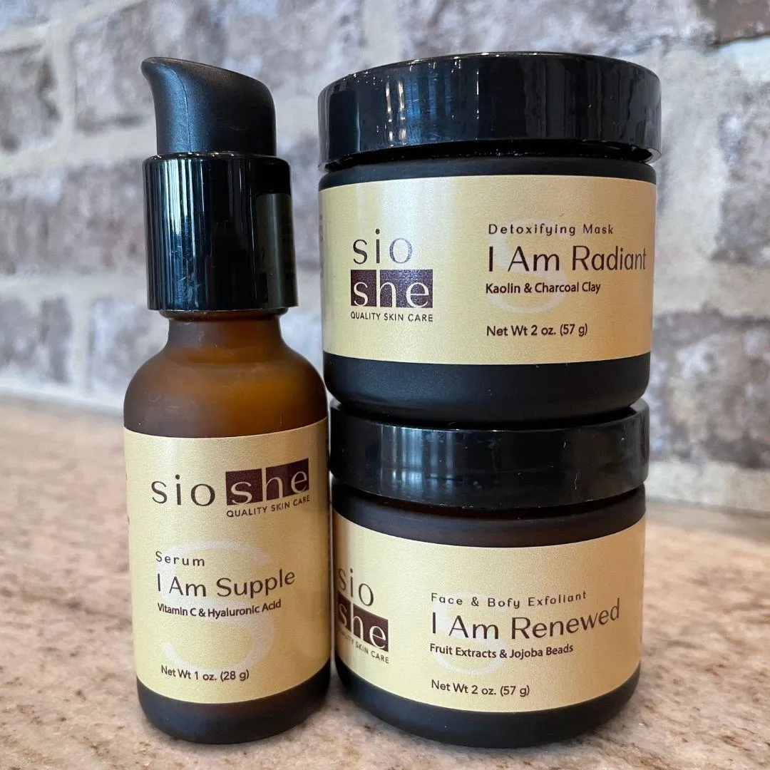
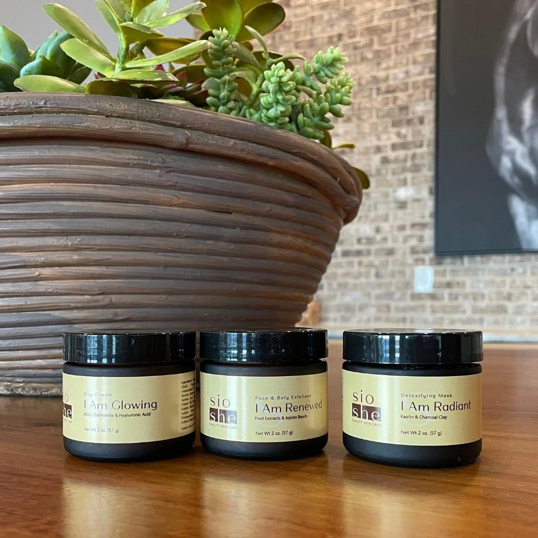
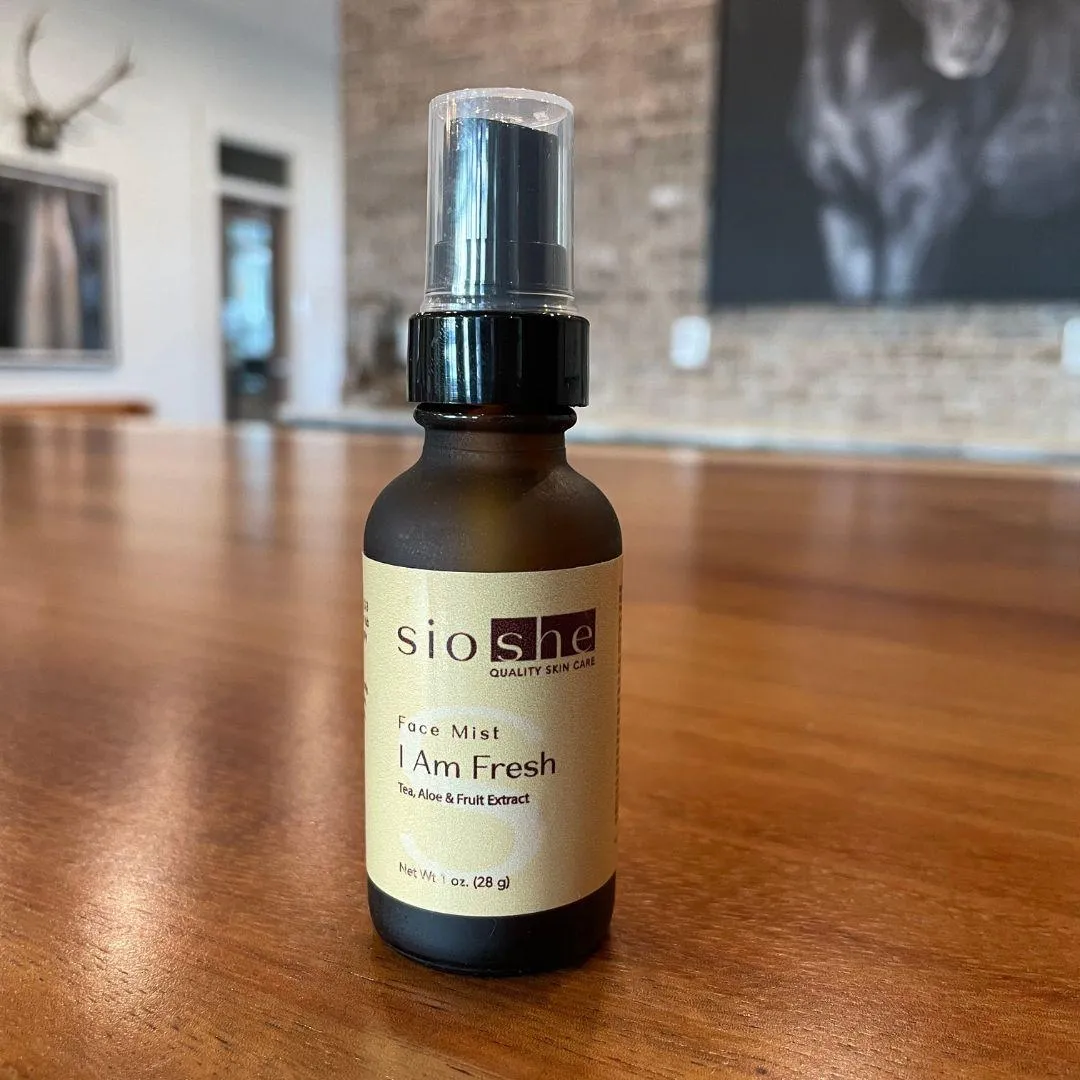
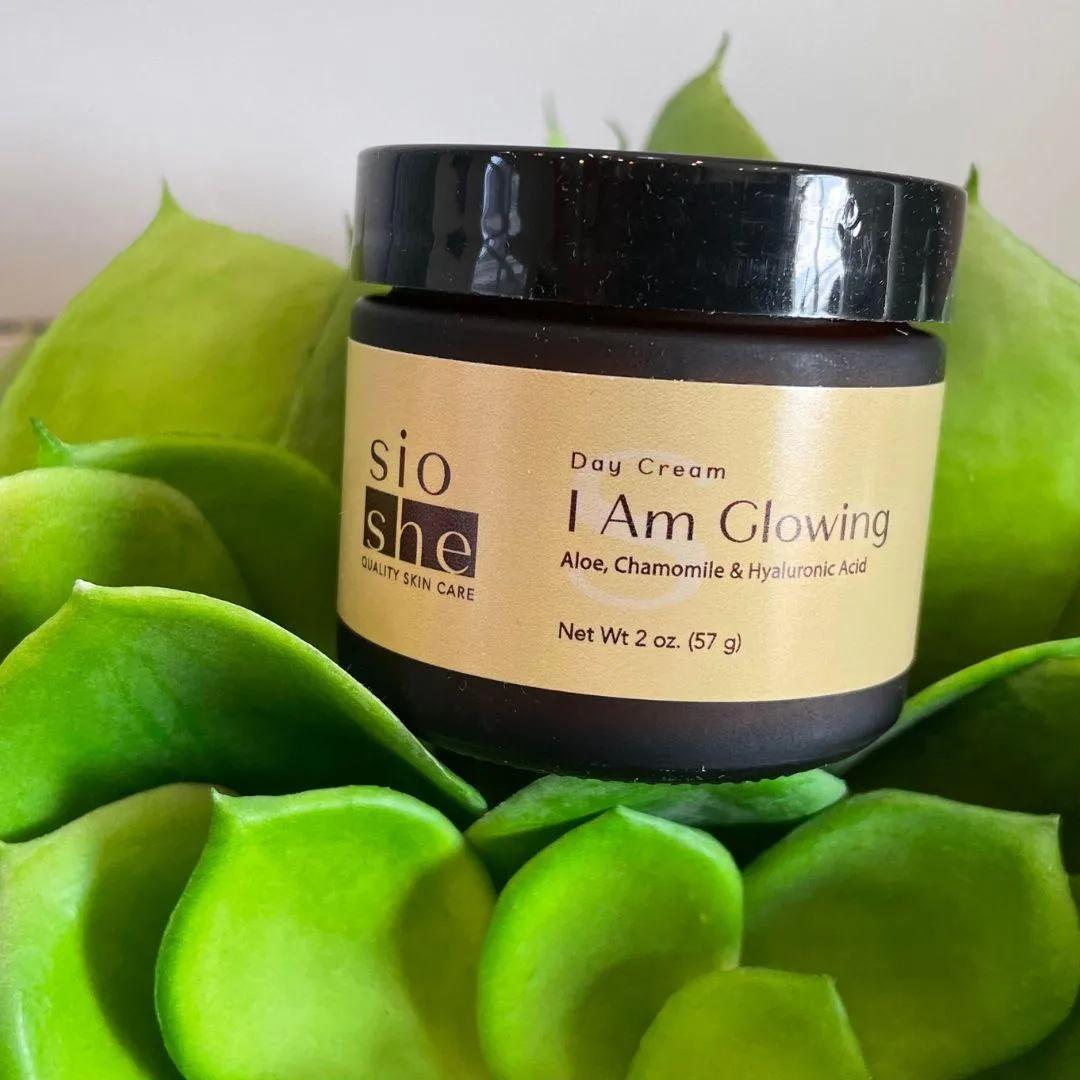
Logo
A modern wordmark (“Sioshe”), simple and sleek. We also included an optional icon that represents balance, like a Libra symbol.
Colors
Inspired by blue chalcedony. Soft, muted tones. No high saturation. Just a gentle, refreshing palette that feels soothing and premium.
Typography
Clean sans-serif fonts with a mix of light and bold weights. Easy to read, modern, and professional.
Imagery
Photos focused on natural light, clean textures, and real moments of self-care. The goal: make the visuals feel authentic, calm, and grounded.
Step Three:
Brand Positioning
Sioshe is inspired by brands like Jo Malone, Herbivore, and Olaplex but it’s not a copy. It stands out by combining elegance with function.
Core Values
Quality, simplicity, elegance, and nourishment
Aesthetic
Calm, clean, and refreshing like stepping into a serene, air-conditioned space after a hot day
Taglines
Natural skincare that works as hard as you do
Self-care for the woman who does it all
The Result
Sioshe now has a strong brand identity it can grow with clean visuals, focused messaging, and a clear purpose. The brand feels high-end but welcoming. Calm but confident.
It’s designed for real women. And it’s ready for launch.
Want to a better product brand label? Book your free call now.

Transform Your Ideas into
Impactful Designs
Designing a brand is about meaning, purpose, and connection. SavvyChic Design has been doing research and analysis for years on how to design a brand perfectly and elegantly. In this case study, we’re sharing how to design the brand identity of a company.
We helped a skincare company Sioshe launch with a strong and elegant brand presence and today, we’ll share the story with you.
Client: Sioshe
Project: Foundational Brand Identity Design
Agency: SavvyChic Design

So, How to design a brand?
Step One:
Understand the Brand Message
Before getting into design, we focused on research. The goal was to fully understand what Sioshe stands for and who it serves.
Sioshe (pronounced See-OH-she) is a clean skincare brand focused on simplicity, self-care, and elegance. It’s made for women who take care of everyone else and are now ready to care for themselves.
We studied the market, looked at competitors, and learned what makes Sioshe different. That helped us shape the visual and verbal identity with purpose. We decided on a few key points.
The Brand Mission
Sioshe helps women reconnect with themselves through simple, high-quality skincare routines.
The tone had to feel calm and confident, not flashy or over-designed. Sioshe stands for quiet strength and everyday luxury.
The Challenge
Sioshe was entering a saturated space. Clean skincare is everywhere. But Sioshe isn’t trend-focused. It’s timeless. The challenge was to stand out while staying soft and grounded.
We Needed To:
Build a premium but approachable identity
Avoid anything overly trendy or high-saturation
Help the brand feel calm, clean, and trustworthy
We designed Sioshe for:
Women aged 28–45
Working professionals, managers, nurturers
Based in the U.S.
People who often put others first
Looking for simple, nourishing routines
Interested in clean ingredients and minimal design
These are women who want skincare that’s easy to use, high in quality, and aligned with their lifestyle.
Step Two:
Design Strategy
We started with a clear plan. Every part of the brand had to reflect calm, elegance, and balance.
Logo
A modern wordmark (“Sioshe”), simple and sleek. We also included an optional icon that represents balance, like a Libra symbol.
Colors
Inspired by blue chalcedony. Soft, muted tones. No high saturation. Just a gentle, refreshing palette that feels soothing and premium.
Typography
Clean sans-serif fonts with a mix of light and bold weights. Easy to read, modern, and professional.
Imagery
Photos focused on natural light, clean textures, and real moments of self-care. The goal: make the visuals feel authentic, calm, and grounded.
Step Three:
Brand Positioning
Sioshe is inspired by brands like Jo Malone, Herbivore, and Olaplex but it’s not a copy. It stands out by combining elegance with function.
Core Values
Quality, simplicity, elegance, and nourishment
Aesthetic
Calm, clean, and refreshing like stepping into a serene, air-conditioned space after a hot day
Taglines
Natural skincare that works as hard as you do
Self-care for the woman who does it all
The Result
Sioshe now has a strong brand identity it can grow with clean visuals, focused messaging, and a clear purpose. The brand feels high-end but welcoming. Calm but confident.
It’s designed for real women. And it’s ready for launch.
Do check out : Branding and Website of Reclaiming Us Consulting Firm
Want to a better product brand label?
Book your free call now.
Transform Your Ideas into
Impactful Designs
Transform Your Ideas into
Impactful Designs
Let’s Work Together and Create Something Extraordinary!
FOLLOW US
Stay connected and inspired! Follow us on our social media platforms to keep up with the latest design trends, project updates, and behind-the-scenes insights
DESIGN SERVICES
LEAD GENERATION
RESOURCES
COMPANY


Copyright 2026. SavvyChic Design . All Rights Reserved. | Privacy Policy | Terms and Condition
Let’s Work Together and Create Something Extraordinary!
DESIGN SERVICES
MARKETING SERVICES
LEAD GENERATION
RESOURCES
COMPANY
FOLLOW US
Stay connected and inspired! Follow us on our social media platforms to keep up with the latest design trends, project updates, and behind-the-scenes insights
Copyright 2026. SavvyChic Design . All Rights Reserved. | Privacy Policy | Terms and Condition