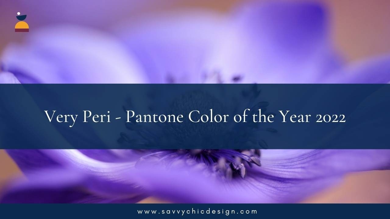
Very Peri - Pantone Color of the Year 2022
Dec 19, 2021
A New Pantone Color Whose Courageous Presence Encourages Personal Inventiveness And Creativity.
It’s finally here!
Every year, I always monitor the Pantone Color of the Year. So I am just so excited to share with you all this amazing release from the Pantone Institute.
So for 2022 we already have the official color which is the Very Peri Pantone 17-3938 for the year.
I didn’t actually expect that 2022 will be the same use of purple. In 2018, the Ultraviolet was the color of the year so I was thinking that it might be something else. But behind the reason or the thought process of this color, is that they said that this actually showcase a carefree confidence and a daring curiosity and that it animates our creative spirit, inquisitive and intriguing, that this Pantone Veri Peri helps us embrace this altered landscape of possibilities and opening us up to a new vision as we rewrite our lives.
PANTONE 17-3938 Very Peri
“As we move into a world of unprecedented change, the selection of PANTONE 17-3938 Very Peri brings a novel perspective and vision of the trusted and beloved blue color family, encompassing the qualities of the blues, yet at the same time with its violet red undertone, PANTONE 17-3938 Very Peri displays a spritely, joyous attitude and dynamic presence that encourages courageous creativity and imaginative expressions.”
~ LEATRICE EISEMAN, EXECUTIVE DIRECTOR OF THE PANTONE COLOR INSTITUTE
How does the Pantone Institute choose the color of the year?
There is a group of experts within the Pantone Institute that carefully studies trends analysis looking for new color influences to the world. Giving thoughtful consideration to different industries such as design, fashion, interior design, including film and entertainment, travel, lifestyle and even the socio-economic conditions. From everything that we are going to see moving forward. It really just gives a sense of excitement in the design world or even in the world that uses a lot of colors to really just give a little bit more of a guidance as well. The Pantone Color of the Year has been a great influence to fashion, design and many more for about 23 years already.
What is the Pantone Color Institute?
This is the Pantone unit assigned to carefully select the Pantone Color of the year and promotes the top seasonal runway colors, forecasts world trends and coordinates with global company brands to effectively leverage the power, emotion and psychology in the design world.
How are these going to complement with other colors? What does it look like combining with other colors? Here is sharing Pantone Institute’s Exploration Palette that you can work with:
Balancing Act
Balancing Act is a complementary palette of color whose natural balance of warm and cool tones support and enhance one other. The brilliance of PANTONE 17-3938 Very Peri is intensified within this artfully calibrated palette, injecting a feeling of liveliness and visual vibration.
So there is more of the cool tone and a warm tone. I really do like the combination of pint of mauve or pink with not too loud orange. It still has that composition that really gives more of a prominent look with this color for 2022 which I really love.
Amusements
Amusements, a joyous and whimsical color story of irrepressible fun and spontaneity is amplified by the carefree confidence and joyful attitude of PANTONE 17-3938 Very Peri, a twinkling blue hue whose playfulness emboldens uninhibited expression and experimentation.
This color combination is so perfect for those who are into a whimsical type of color story, more joyous and vibrant. I do love how this paradise pink and pink flambé relates to each other.
The Star of the Show
The dynamic presence of PANTONE 17-3938 Very Peri comes through in The Star of the Show, as we surround this happiest and warmest of all the blue hues with a palette of classics and neutrals whose essence of elegance and understated stylishness convey a message of timeless sophistication.
This combination is perfect for those who want more of a classic, subtle, earth tones and not too loud colors and yet still elegant and stylish.
Wellspring
A holistic and harmonious blend of nature infused shades, Wellspring highlights the compatibility of the greens with good-natured PANTONE 17-3938 Very Peri, and the health-giving properties of these deliciously subtle and nourishing hues.
This is a very good way of combining the greens with purple for those who love nature and health.
I invite you to watch my video 2022 Color Pantone of the Year as I show you more on how you can play around more, combining these color palettes and using the Pantone Color of the year, Veri Peri, and become really creative with your designs.
Let us know what you think about this color and if this is something that resonates with you. Are there any other colors that you think that will complement this color of the year, Very Peri?
Write them down in the comments section below and we are so excited to hear about your thoughts!
Stay Savvy,
Joanna
Stay connected with news and updates!
Join our mailing list to receive the latest news and updates from our team.
Don't worry, your information will not be shared.
We hate SPAM. We will never sell your information, for any reason.


